Orbit Music App
A unique yet realistic music app prototype. Mines was based on the name 'Orbit' and with this, I attempted to make a lot of my assets rounded in some form, sort of orbiting around the page.
Project Brief
To design and create a digital prototype in Figma of a music app. Must contain 3-6 screens such as home, menu, and music screen. Other screens can be designed based on what I think is suitable.

My Idea
When coming up with ways to make my app unique compared to my competitors, I wanted to keep the app functional yet different. My idea was to make a space themed music app, in response to its future name 'Orbit'. I tried my hardest to avoid the plain vinyl style, a lot of people have done or plan on doing.
Research
first began creating a mind map board of anything that pops into my head when I think of a music app. Such as, what features are used within the UI, what genres there are, colours and their meanings, competitors, etc.

Competitor Research
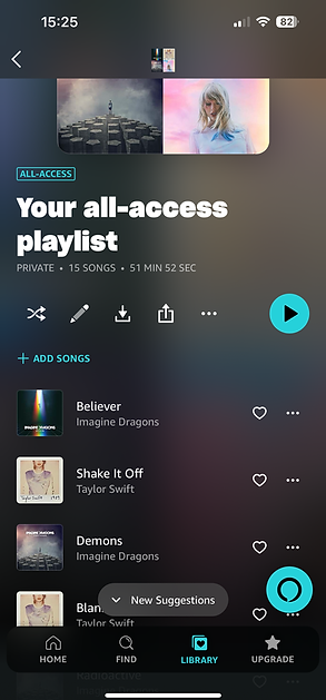
In particular, I looked at two apps I used the most, which were Spotify and amazon Music. Upon looking into my competitor, Spotify I decided to screenshot every page that popped up as if I wanted to play a song listed in my favourites. The reason I looked at Spotify as references is mostly due to the popularity of the app.
their liked songs are always the first thing to appear when they open the app, making it fast and easy access to the app. Whilst they have the opportunity to displayed new/ featured songs just below for advertising, and then providing a ‘Made for you’ song list that was made based on the genre or types of songs I listen to.


Amazon music was the other music app I was highly aware of, although I never really used it before, so I decided to go out of my way and created an account just to give my first impression on how the app looks and functions to new users.
At first glance I noticed that it was all very visual based. Meaning the images over took the text which I believe made it more accessible especially to anyone that may struggle to read or see.
Another difference was the colour palette. Between the first tow windows the background was pure black, similar to Spotify. However, the difference between Spotify would be in the favourite songs page, is displayed with a soft gradient and blurred background, which I actually liked it. It was different and actually pretty relaxing to look at.
As for the icon features within this app, comparing it to Spotify they all have extremely similar and familiar icons, all of which are found in the exact same locations on both apps.

Prototypes & Concepts
I began coming up with potential designs for my music app, in as many different ways as possible, all of which I thought would be suitable. When coming up with these designs I took a loot at existing apps such as Spotify, and Amazon music, and used these references to draw a basic potential layout for a couple of my pages.
I began by sketching up designs for my home page and decided to choose one of my favourites, and further refined it into a little more detail, just to see what it would look like or if it was out of my league to do.


In developing my music app was further refining my page concepts into a digital format. At this point I was still deciding on a good home page layout that would help me set the vibe for the rest of the app.
There were the 3 different designs I came up with when putting my drawings onto Figma. I started with the original concept idea as I thought it would be useful to have, as well as possible in keeping me convinced that it would have been a good design.
Upon further investigating into the design, I wasn't really happy with how it looked or how it would function so I designed two more potential competitors, one with similar creativity and another very basic just in case I find basic as workable.
Eventually, I decide to go with the middle design. The reason for this is due to the creativity of it, keeping it more in line with my brand and its name. I also liked how it was designed as it not only was different but could also be pretty functional when selecting icons and music. I also came up with the idea that the app icons could spin around when scrolling though sort of like a rotary.

Digital Developments
I decided to take it easy and create a splash page as well as the main home page first with as much detail as possible. The reason for this was to give me an idea of any design aspects that may or my not work for there rest of the app. I really liked the use of colours I had previously chosen and decided to keep it consistent throughout.
As seen on the Home Screen the circles are orbit lines for the icons and music covers. For icons on the home page, I struggled to find out what features to include, eventually coming up with the ‘Playlist’ and ‘4D’ buttons. As for the icons, I simply remade them using my sketches, that was shown earlier within the project.
I wanted to include some form of prototyping to the main page. When coming up with the design, I wanted the user to have the ability to scroll through the album covers in a circular motion.


Reflection
Following the completion of these pages, I would receive feedback on the overall app I had created so far, in which was pretty positive. My tutor really liked the design concepts I had come up with, especially with the motor design. He also really liked the use of my colours which was important to me as I wasn't sure when it was suitable to use my colours and which ones at this stage of my designs.
As for improvements that were needed there wasn't so much of this either, as most of it consisted of spacing and sizing with my icons and text. What I mean by this is, the mini wheel in the home page that featured icons and text felt too claustrophobic and was recommended that I alter them to make them more visually appealing to the app.

