Pluto Banking Brand
A collection of work that features all of my development during my banking app and brand design. Using Figma, I based this app off of Monzo, as well as having a link to a younger audience and space themed, hence the name Pluto.
Project Brief
My task for this project is to redesign or create a brand for an existing bank company such as AIB, Barclays, Nationwide, etc, and rebrand it into a more modern banking app such as Monzo.

My Idea
I first looked at other bank names and all of them seemed to have a one thing in common. They really easy to pronounce/ they are recognised. I also wanted to have one key feature that would resonate with my banking name that also portrays a history to the meaning behind of the name.
I would break the name down into ‘Pluto’. The reason for this is it made it a lot easier to pronounce, as well as giving me pretty good ideas for potential content designs and logos. Personally, I really like the name as its simple, iconic, easy to pronounce, and of course it has a pretty good link to finance.
Another reason I went for the name ‘Pluto’ is the copyright behind it. When looking into it, because the name of a planet is called ‘Pluto’ and it being a single word, there is no domain available to copyright the name. However, Pluto, the Disney character is copyrighted, luckily for me it’s the character that's copyrighted and not his name.
Research
Looking into the apple health watch app, I noticed that it already does a fairly realistic imitation of what I want my app to do, which is mostly motion tracking as well as blood pressure, sweat and stress.
I noticed when looking for evidence that it a screenshot, shown here shows how the app recommended resting your arms or legs, which is fantastic to see. The reason I say this is that I thought finding already existing competitors for what I want my app to do was going to be next to impossible.
Knowing all this made it easier for me to create my idea and put it to action, whilst also giving me assurance that it is possible. I would be able to have the apple health app as a sort of shoulder to lean on when it comes to any features or content to take inspiration from when intergrating it into my app.
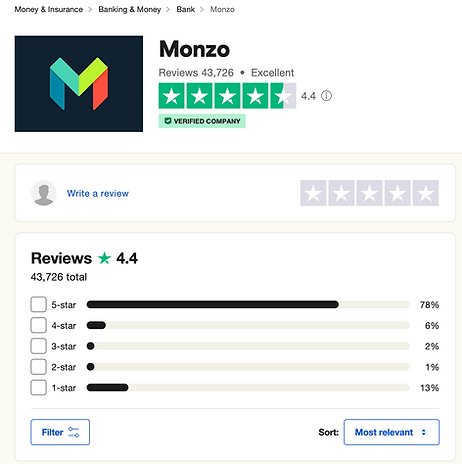
Monzo having an ‘Excellent 4.4” star rating is mind blowing to see, as when I looked into the previous 3 banks (HSBC, Barclays, and Nationwide) they were all 1-2 star and in the red.
Aside from this looking further into the reviews, a lot of people reference saving pots, the app being super simple and user friendly, with very minimal negative reviews. The app being marked down is mostly due to outside of app based feature like, depositing money into an atm.
Brand Development
Name/ ideation
When it came to coming up with a name for my banking company I first looked at other bank names and all of them seemed to have a one thing in common. They really easy to pronounce/ they are recognised.
I began ideating a couple of potential names, I looked at existing bank names that may help me break down or come up with new names. I then listed anything that came into my mind as well as looking at other cultures around the world such as Greece or Japan, to see if I can base a name around their translations.

Finally, between the finally 5 choices I asked a couple of people for a second opinion on what name would suit best, eventually that fell to the name, Pluto. The reason I chose this name is when researching different words and their meanings, I came across the greek god of wealth and prosperity, Plutus.
Eventually I would break the name down into ‘Pluto’. The reason for this is it made it a lot easier to pronounce, as well as giving me pretty good ideas for potential content designs and logos. Personally, I really like the name as its simple, iconic, easy to pronounce, and of course it has a pretty good link to finance.
Word Mark- Pluto
My next development stage is creating a logo for my banking app or well refining the title and I do plan on working on this stage with my chosen font.


Eventually, I began playing around with the Typeface along with their anchor points. I wanted to use LEXEND as much as possible but with my own style.
Eventually, I would finish my Logomark with this being my chosen design. The reason I went for this is not only how well it looks but also that sci-fi type of feel it gives. I would also be able to use the ‘O’ within my design in a fairly modular way, not only to be used as a planet outline but if I wanted I could make it look like a shine from the side of a coin.
Logo Mark- Pluto
This was a logo I originally made before making my final choice but I eventually didn't go through with it as it was giving the same vibe as when I designed my Word Mark. Upon looking for some feedback. My class mate recommended that I just use the ‘O’ from my wordmark as its own logo. Upon following through with the suggestion I was pretty happy with how it looked and how it communicated what I wanted the logo to represent.

Finally, I also decided to go out of my way to create a secondary logo/ icon for my brand which could be used in many different ways. I designed this based from what I was receiving based on my classmates recommending me to include a form of ship to my brand. Eventually I decided to include it into one of my logo variations, enabling me to have the option to either add it, remove it or keep it as a separate logo.
Choosing my colours
Straight away not only did I look into the colours, but my classmates and my tutor also recommended that I look at the actual planet of Pluto and choose the colours from there. As they not only already have that connection to my brand and the name but also provide a lot of different colours from yellows, greens, blues and reds but they all also work together pretty well.
I played around about within having the colours be sperate and mixed in to my logo/ Wordmark, as well as experimenting with how well they looked as a colour gradient. Following this outcome, I was actually pretty surprised as to how well all these colours worked together.
On top of that I also made sure the colours I chose were accessible friendly, in correlation to why I chose LEXEND for my font, not only is it important but it also expands my target audience as well as looking visually pleasing.

The Maroon is going to be my primary colour choice for my brand as I think it is the most striking of the 3, as well as standing out from my existing competitors who all tend to use bleu for their colour palette. The reason blue is used is due to its link to the being ‘Trustworthy’.

Building my app
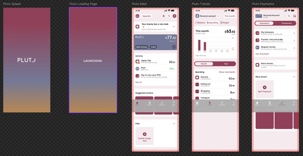
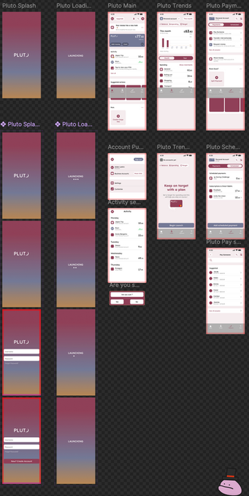
Finally, it was time to start building my banking app prototype. There were tons of elements and features I really want to have implemented into this prototype, all of which was helpful with using Monzo as a heavy inspiration. My plan was to make my bank app as similar as possible but create elements in it to make it as unique as possible. My reason for this is how similar Monzo correlates with my target audience, my brand values and my tone of voice.
I kept screenshots of the different pages from the Monzo app as well as using Mobbin and other bank pages for inspiration when coming up with my concepts. I also thought it would be a good idea to have a forward interaction plan when it came to showcasing my app. I learned this idea during my time in tech under my graphic design course. What I mean by this is I plan on creating pages for my app which start with the splash screen and finish with a transfer success page, with each page being designed and prototyped for the user to go through along the way.
Banking App
I created this banking app using Monzo as it's base layer, revamping as much icons as possible to help fit Pluto's Brand. All assets, as well as wireframes and prototypes were created using Figma software, with a total of 12 weeks to complete.

Brand Guidelines
This was a second, mini project as part of this over all brand project. My guidelines explains all my assets, fonts, icons, and colour choices about my brand and how they should be used.

Landing Page
This was my third and final mini project as part of my over all brand project. My landing page was created in Figma, it was a sort of mockup website that explains and shows off my app prototype.
It also explains my apps unique features as well as showing off mockup prototypes for my brand.

